
My app was failing my users.
When I built SnapJournal, I had one type of user in mind: someone like me, who writes in a daily planner. One page, one day, one set of schedules. That was the entire mental model the app was designed around.
Then I looked at the analytics. And the analytics had a very different story to tell.
Process
- The Problem
- The Inspiration
- The Solution: Swipe to Review
- Conclusion
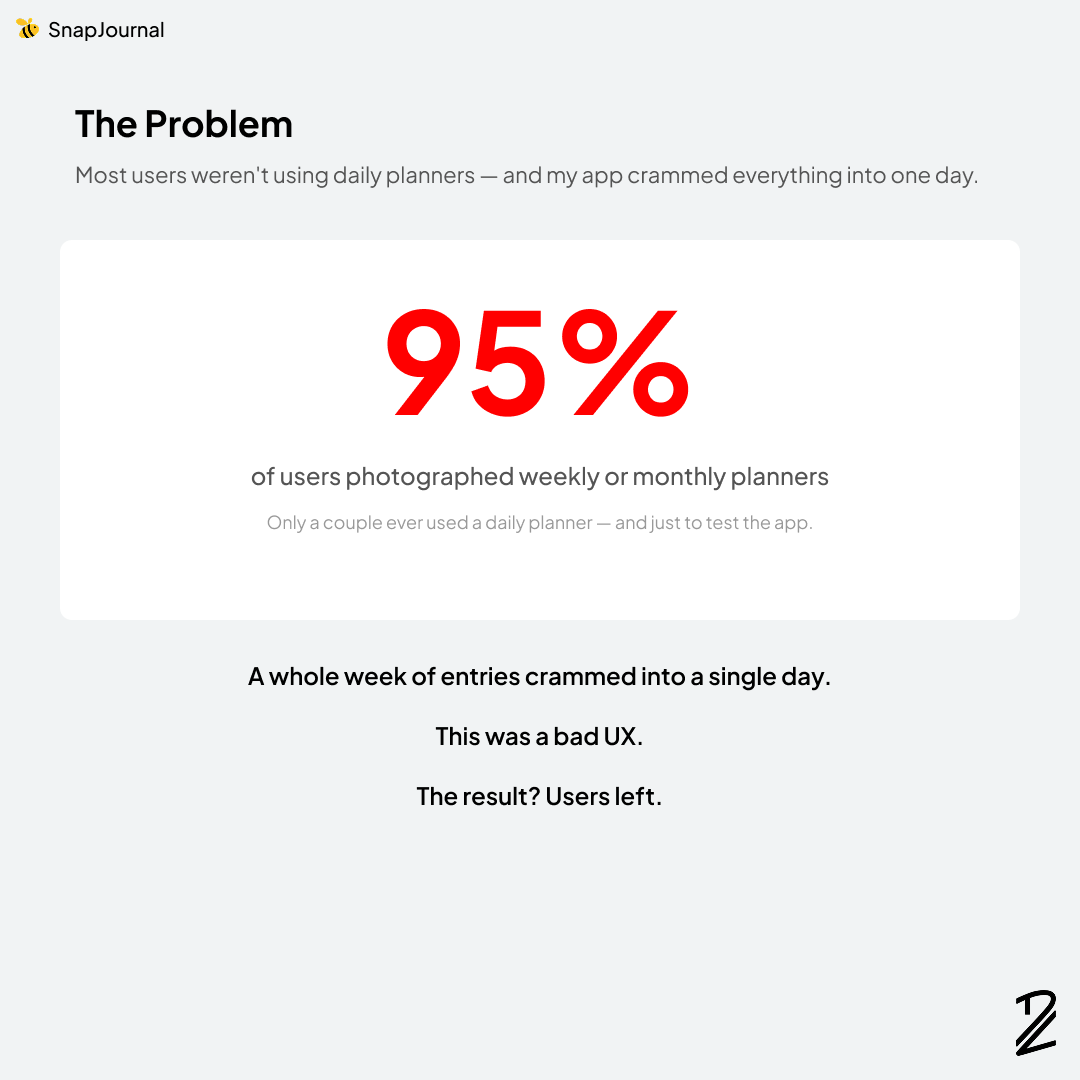
The Problem
Over 95% of users were photographing weekly or monthly planners. Only a couple had ever pointed the camera at a daily planner, and even then, it was usually just to test the app out.
This was a problem. A big one.
SnapJournal's AI faithfully reads every schedule it sees on a page. So when someone snapped a weekly planner, with seven days of plans all on one spread, the app dutifully extracted everything and crammed an entire week of entries into a single day on the timeline.
The result was a mess. Schedules stacked on top of each other. Wrong dates. No way to make sense of it.
Users left. And I don't blame them.
The Inspiration
I scrambled to come up with a fix. The technical part was straightforward, since the AI could already detect dates correctly. I just needed to map each entry to the right day. But the interface was the hard part. How do you let a user review and confirm a whole week (or month) of extracted entries without overwhelming them?
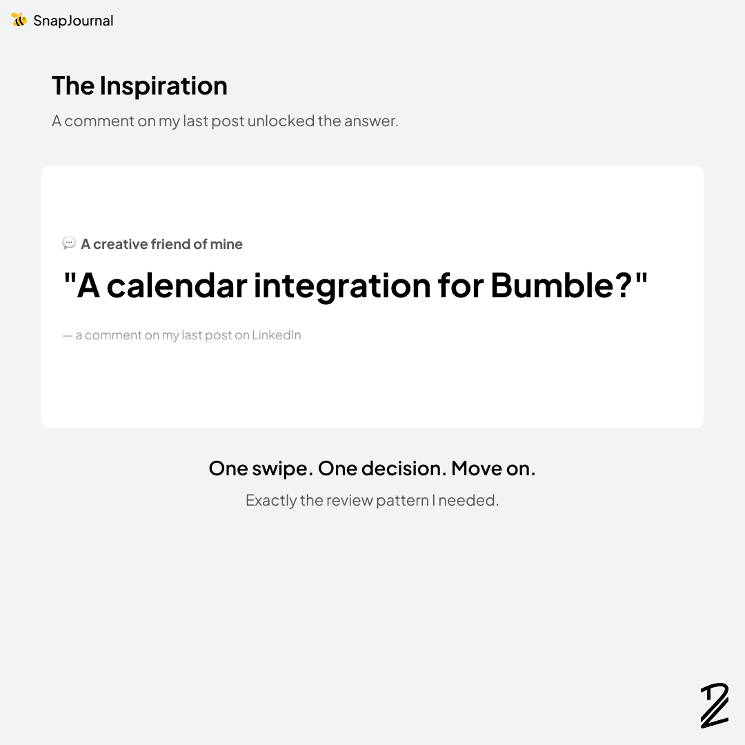
That's when I remembered the comment.
In my last post, Cameron Renacker had dropped a comment about Bumble. At the time, I thought it was a fun aside. But sitting there staring at the problem, it clicked.
Bumble's swipe interaction is one of the most intuitive review patterns ever designed. You see one card. You make one decision. You move on.
That was exactly what I needed.
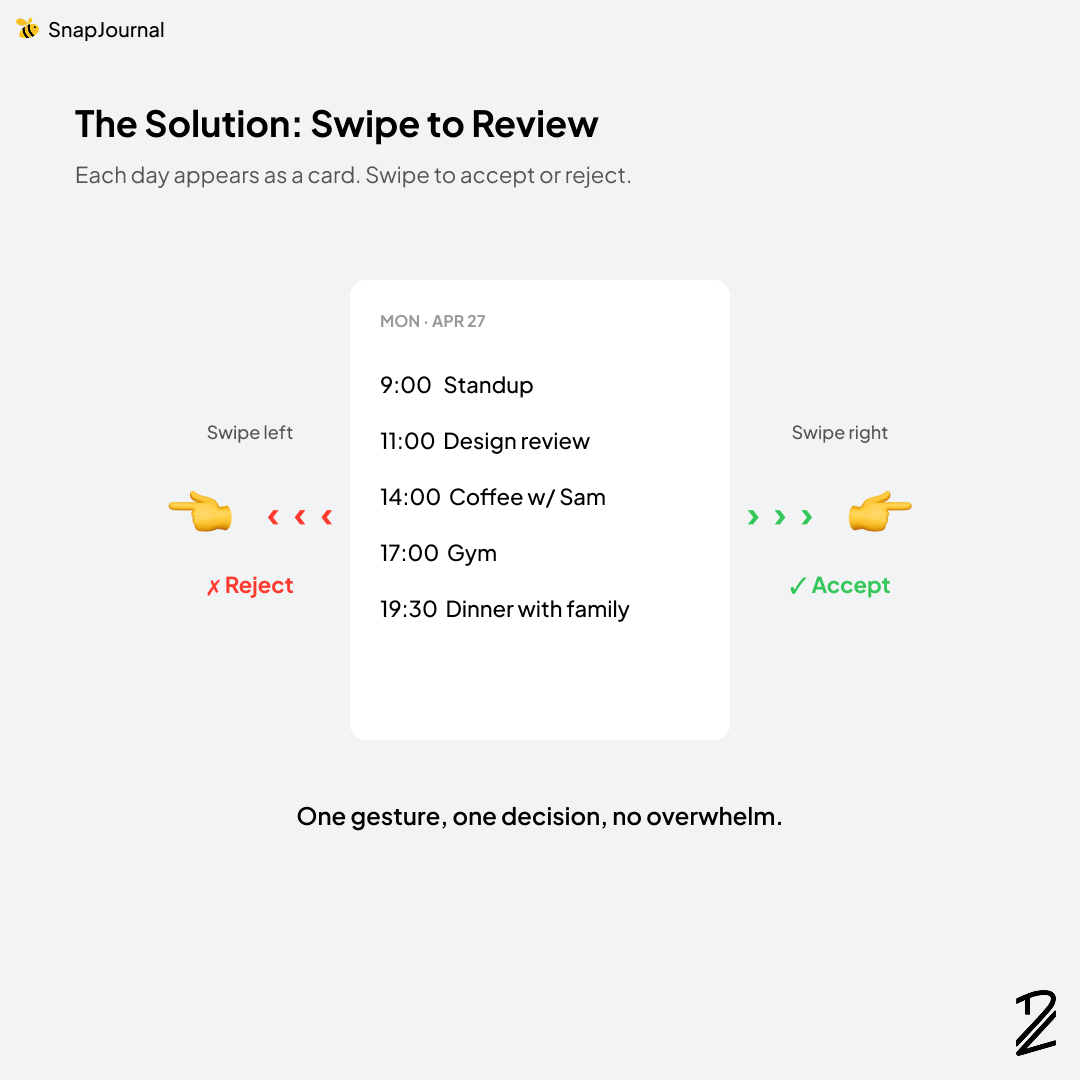
The Solution: Swipe to Review
Here's what the new flow looks like:
- Take a picture of any planner. Daily, weekly, or monthly.
- SnapJournal extracts every entry and groups them by day.
- Each day appears as a card you can review.
- Swipe right to accept the entries for that day.
- Swipe left to reject them.
One gesture. One decision. No chaos.
It also turned out to be genuinely fun. Reviewing extracted entries used to feel like data entry. Now it feels like a small game. Quick taps of decision making before everything lands cleanly on your calendar.
Conclusion
Two things made this update happen.
Real user behavior. Without the analytics, I would have kept assuming everyone used daily planners, because I use a daily planner. The data forced me to confront a gap I couldn't see from inside my own habits.
A single comment from a creative friend. Cameron's Bumble reference wasn't a feature request. It was barely even a suggestion. But it was the right metaphor at the right time, and it solved a UX problem I'd been circling around for days.
This is the part of building in public I love most. The product gets shaped by the people using it and the people watching the journey. I just have to listen.
What's a feature in an app you use that you wish worked more like a totally different app? I'd love to hear.

Download the app with this link: https://apps.apple.com/us/app/snapjournal/id6756394072