
The final idea may be very different from the initial brainstorming. That’s exactly what happened when I designed an icon for SnapJournal.
Process
- Raw brainstorming
- Keywords
- First draft
- Second draft
- Final draft
Raw brainstorming
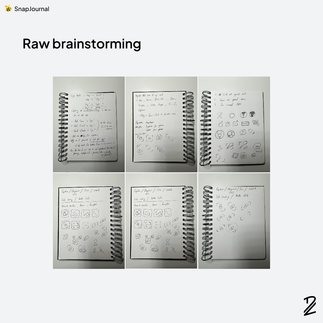
Since SnapJournal's core function is capturing a journal, planner, or diary, I started by focusing on concepts like frames, cameras, and time. But here's the thing: this app is just the first step in a much bigger vision—one that extends beyond journaling into a comprehensive life improvement tool.
I didn't want to box myself into ideas that only represented the initial feature set. So I expanded the brainstorming to include concepts that felt more holistic and forward-looking: sun, sunrise, orange, and other imagery that conveyed growth and vitality.
Keywords
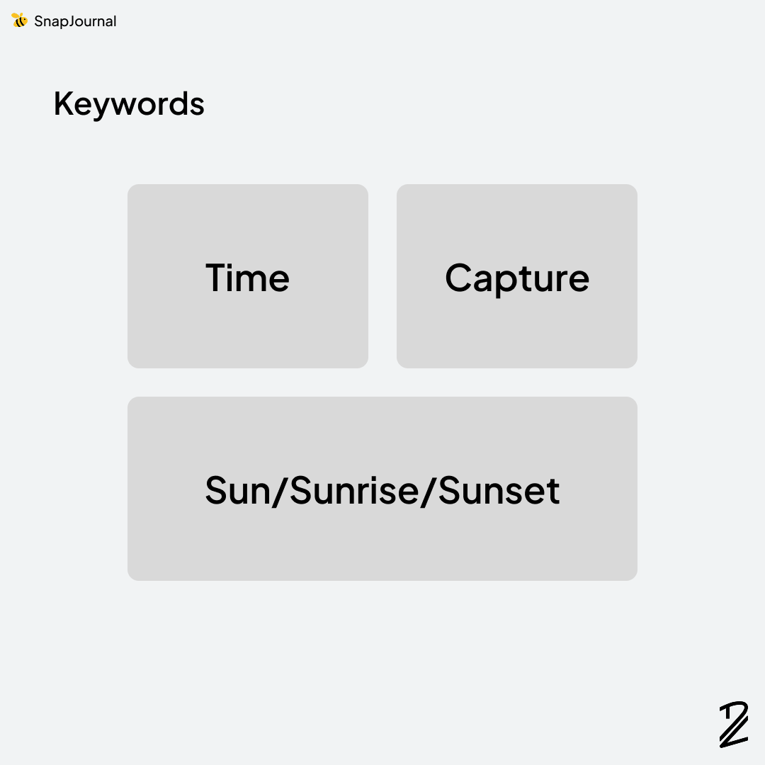
After narrowing down all the ideas, I landed on three core keywords: Time, Capture, and Sun (sunrise/sunset).
First draft
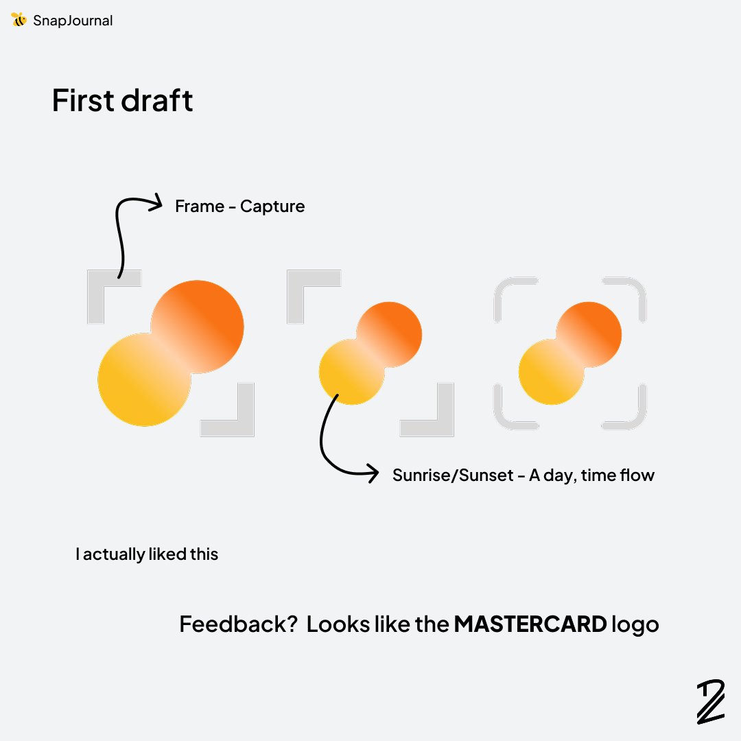
Using those keywords, I created my first draft. The left version had a solid, rigid frame, but the right one resonated more. The two overlapped circles and rounded frames were more balanced. I was pretty happy with it initially, but after getting feedback that it looked too much like the Mastercard logo, I knew I needed to pivot.
Second draft
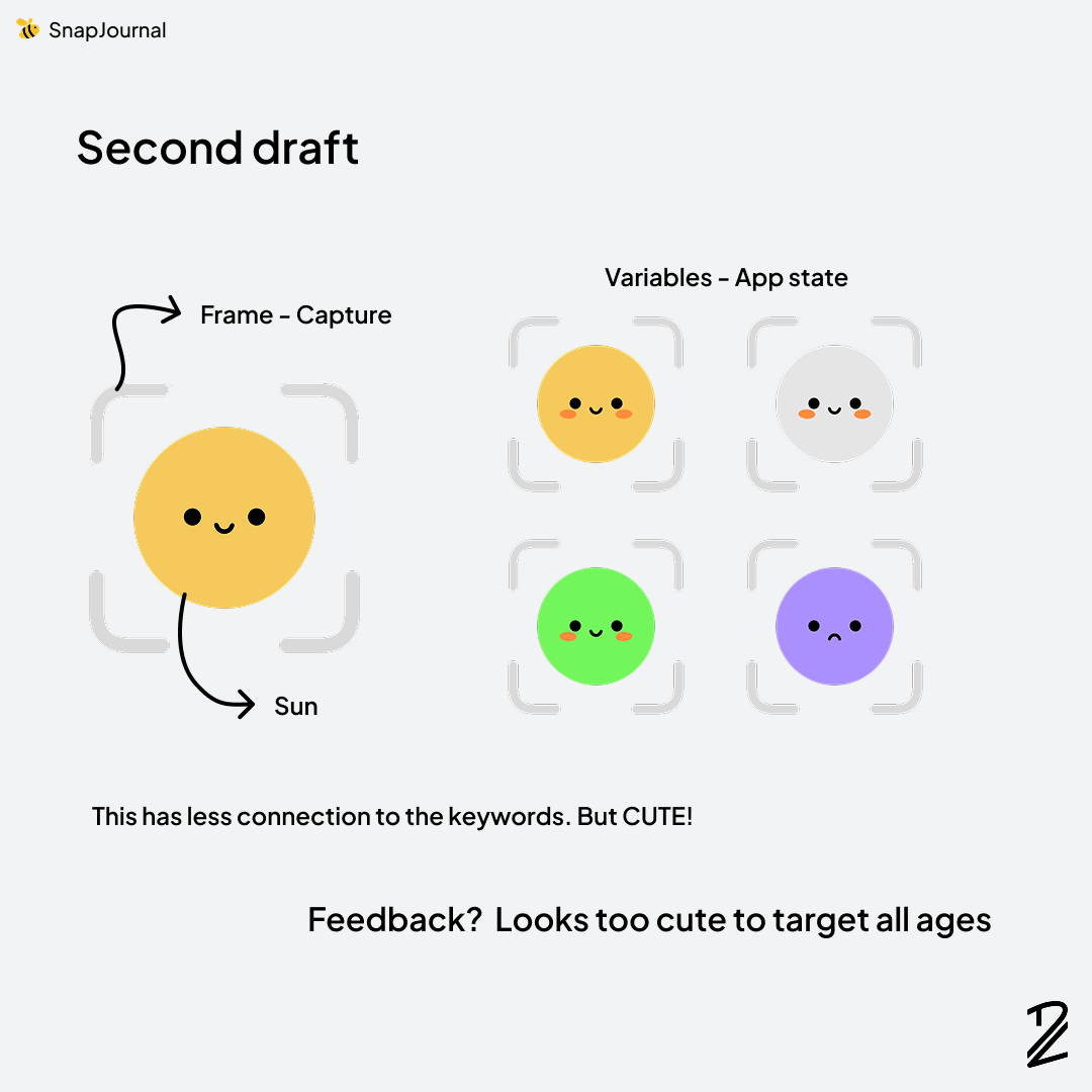
This icon wasn't originally intended to be the icon. The cute circle character was designed to show app status during usage. But when I got feedback that it created visual inconsistency with the first draft, I experimented with using it as the main icon.
It was charming at first glance, but SnapJournal targets all ages and genders. For some users, this might feel too cutesy. Time for another iteration.
Final draft
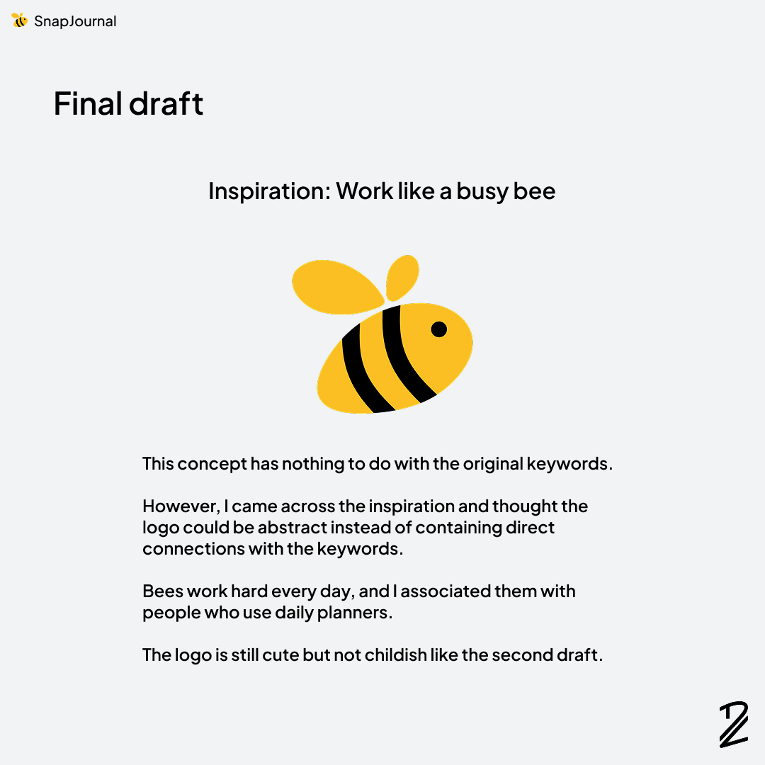
Last but not least: the bee icon
This idea actually came out of nowhere. While I was struggling with the next iteration, I stumbled across a phrase: "Work like a busy bee." At first, I didn't think much of it, but the concept started clicking into place. As someone who writes in a daily planner religiously, I'd consider myself hardworking or at least committed to the grind. I figured anyone who takes the time to plan their days probably shares that trait: diligent, organized, and intentional. The bee became a natural metaphor for the target user. Plus, it struck the right visual balance. It maintains a friendly, approachable vibe without skewing too childish. Something that works across all age groups and demographics.
Conclusion
Icon design isn't a straight line from concept to final product. It's an iterative process that requires flexibility and feedback. What started as literal interpretations of "capture" and "time" evolved into something I never expected: a bee. The key lesson here? Don't get attached to your first idea. The overlapping circles felt right at first, but external feedback (the Mastercard comparison) forced me to reconsider. The cute character had potential, but didn't fit the demographic. Only by staying open to unexpected connections, like a random phrase about busy bees, did I land on something that actually worked. The bee icon checks all the boxes: it's visually distinct, scales cleanly across different sizes, carries meaningful symbolism that aligns with the target users, and maintains broad appeal without feeling corporate or childish. More importantly, it has room to grow as SnapJournal expands beyond journaling into a comprehensive life improvement tool. Sometimes the best ideas come from the most unexpected places. Stay flexible, embrace feedback, and don't be afraid to kill your darlings when something better comes along.